UX Research & Design
HighFlyBet
Onboarding redesign, applying behavioral design principles to reduce registration drop-off and improve conversion across the full sign-up flow.
Platform :
Web & Mobile
Industry :
iGaming
Role :
Product Designer
Scope :
UX Research & Design

Problem :
Analytics revealed that 62% of new visitors were abandoning the registration flow before completion. Session recordings and GA4 pointed to a second gap earlier in the journey: 73% of non-registered users never reached the registration screen, and 68% left before encountering any of the platform's value proposition.
Non-registered users had no access to promotions, gamification features, or perks before being prompted to register, creating a trust gap at the most critical point of the acquisition funnel.
The sign-up CTA carried no visual distinction from surrounding elements, and the bottom navigation offered no secondary registration path. The interface had no persistent conversion trigger at any point in the user journey.

Challenge :
Two distinct problems needed solving at different stages of the same funnel.
The first sat before the form ever opened: with the menu gated behind login, there was nothing for a visitor to build confidence on.
Once inside the registration flow, three friction points were driving mid-completion abandonment: no persistent reminder of the reward awaiting completion, no frictionless sign-up alternative for users unwilling to fill a full form, and no promo code field for the segment arriving from paid campaigns, which GA4 campaign data put at 15% of inbound traffic.

Solution :
Five targeted interventions were applied across both the landing state and the registration flow.
A hamburger menu was introduced for non-registered users, giving them access to promotions, gamification, and brand perks before committing, directly addressing the trust gap identified in session recordings. FullStory behavioral segmentation, comparing users who engaged with at least one brand feature against those who went directly to the sign-up flow, showed a 2.3x higher likelihood of completing registration among the first group.
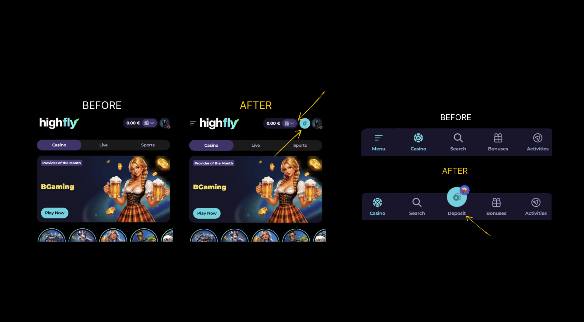
The Serial Position Effect informed placing a second sign-up button in the bottom navigation, ensuring the call to action remained visible at both the primary and final scroll positions. Post-login, this button transitions into the deposit action, a touchpoint not previously present in the interface, now serving a critical revenue function from the first session.
Inside the registration flow, the Zeigarnik Effect was applied by keeping the welcome package offer visible throughout the entire form completion. GA4 funnel tracking measured a 28% reduction in mid-flow abandonment following implementation, as users maintained a clear sense of what completing the task would unlock.
A promo code field was added after GA4 UTM campaign data identified that 15% of new registrations arrived via external ad campaigns with no clear path to apply their incentive, a friction point causing silent drop-off in paid acquisition funnels.
A Google sign-up option was also introduced, reducing required form fields and lowering completion effort. GA4 event segmentation, filtering completions by authentication method, showed a 31% improvement in registration completion rate among users who opted for Google sign-in, directly contributing to overall reg2dep improvement.
Results :
The combined interventions addressed registration drop-off at every stage, from first landing to form completion. Sign-up conversion increased by 24% following implementation, directly reducing the abandonment rate identified at the outset of the project.
The reg2dep rate improved by 29% in the 30 days following launch, moving from 24% to 31%, bringing the platform above the industry average for its target market.
The post-login navigation was restructured to prioritize revenue touchpoints throughout the session. The wallet icon, previously occupying the top-right header, was relocated under the profile section, with that position reassigned to a bonus section, increasing perceived platform value at the point of login.
A dedicated deposit button, visually highlighted and centrally positioned in the navigation bar, was introduced applying the Serial Position Effect to the primary revenue action, closing a previously missing revenue touchpoint and ensuring deposit remained the most prominent and accessible trigger for newly registered players from their first session.
More Projects


UX Research & Design
HighFlyBet
Onboarding redesign, applying behavioral design principles to reduce registration drop-off and improve conversion across the full sign-up flow.
Platform :
Web & Mobile
Industry :
iGaming
Role :
Product Designer
Scope :
UX Research & Design
Problem :
Analytics revealed that 62% of new visitors were abandoning the registration flow before completion. Session recordings and GA4 pointed to a second gap earlier in the journey: 73% of non-registered users never reached the registration screen, and 68% left before encountering any of the platform's value proposition.
Non-registered users had no access to promotions, gamification features, or perks before being prompted to register, creating a trust gap at the most critical point of the acquisition funnel.
The sign-up CTA carried no visual distinction from surrounding elements, and the bottom navigation offered no secondary registration path. The interface had no persistent conversion trigger at any point in the user journey.
Challenge :
Two distinct problems needed solving at different stages of the same funnel.
The first sat before the form ever opened: with the menu gated behind login, there was nothing for a visitor to build confidence on.
Once inside the registration flow, three friction points were driving mid-completion abandonment: no persistent reminder of the reward awaiting completion, no frictionless sign-up alternative for users unwilling to fill a full form, and no promo code field for the segment arriving from paid campaigns, which GA4 campaign data put at 15% of inbound traffic.
Solution :
Five targeted interventions were applied across both the landing state and the registration flow.
A hamburger menu was introduced for non-registered users, giving them access to promotions, gamification, and brand perks before committing, directly addressing the trust gap identified in session recordings. FullStory behavioral segmentation, comparing users who engaged with at least one brand feature against those who went directly to the sign-up flow, showed a 2.3x higher likelihood of completing registration among the first group.
The Serial Position Effect informed placing a second sign-up button in the bottom navigation, ensuring the call to action remained visible at both the primary and final scroll positions. Post-login, this button transitions into the deposit action, a touchpoint not previously present in the interface, now serving a critical revenue function from the first session.
Inside the registration flow, the Zeigarnik Effect was applied by keeping the welcome package offer visible throughout the entire form completion. GA4 funnel tracking measured a 28% reduction in mid-flow abandonment following implementation, as users maintained a clear sense of what completing the task would unlock.
A promo code field was added after GA4 UTM campaign data identified that 15% of new registrations arrived via external ad campaigns with no clear path to apply their incentive, a friction point causing silent drop-off in paid acquisition funnels.
A Google sign-up option was also introduced, reducing required form fields and lowering completion effort. GA4 event segmentation, filtering completions by authentication method, showed a 31% improvement in registration completion rate among users who opted for Google sign-in, directly contributing to overall reg2dep improvement.
Results :
The combined interventions addressed registration drop-off at every stage, from first landing to form completion. Sign-up conversion increased by 24% following implementation, directly reducing the abandonment rate identified at the outset of the project.
The reg2dep rate improved by 29% in the 30 days following launch, moving from 24% to 31%, bringing the platform above the industry average for its target market.
The post-login navigation was restructured to prioritize revenue touchpoints throughout the session. The wallet icon, previously occupying the top-right header, was relocated under the profile section, with that position reassigned to a bonus section, increasing perceived platform value at the point of login.
A dedicated deposit button, visually highlighted and centrally positioned in the navigation bar, was introduced applying the Serial Position Effect to the primary revenue action, closing a previously missing revenue touchpoint and ensuring deposit remained the most prominent and accessible trigger for newly registered players from their first session.
More Projects
UX Research & Design
HighFlyBet
Onboarding redesign, applying behavioral design principles to reduce registration drop-off and improve conversion across the full sign-up flow.
Platform :
Web & Mobile
Industry :
iGaming
Role :
Product Designer
Scope :
UX Research & Design
Problem :
Analytics revealed that 62% of new visitors were abandoning the registration flow before completion. Session recordings and GA4 pointed to a second gap earlier in the journey: 73% of non-registered users never reached the registration screen, and 68% left before encountering any of the platform's value proposition.
Non-registered users had no access to promotions, gamification features, or perks before being prompted to register, creating a trust gap at the most critical point of the acquisition funnel.
The sign-up CTA carried no visual distinction from surrounding elements, and the bottom navigation offered no secondary registration path. The interface had no persistent conversion trigger at any point in the user journey.
Challenge :
Two distinct problems needed solving at different stages of the same funnel.
The first sat before the form ever opened: with the menu gated behind login, there was nothing for a visitor to build confidence on.
Once inside the registration flow, three friction points were driving mid-completion abandonment: no persistent reminder of the reward awaiting completion, no frictionless sign-up alternative for users unwilling to fill a full form, and no promo code field for the segment arriving from paid campaigns, which GA4 campaign data put at 15% of inbound traffic.
Solution :
Five targeted interventions were applied across both the landing state and the registration flow.
A hamburger menu was introduced for non-registered users, giving them access to promotions, gamification, and brand perks before committing, directly addressing the trust gap identified in session recordings. FullStory behavioral segmentation, comparing users who engaged with at least one brand feature against those who went directly to the sign-up flow, showed a 2.3x higher likelihood of completing registration among the first group.
The Serial Position Effect informed placing a second sign-up button in the bottom navigation, ensuring the call to action remained visible at both the primary and final scroll positions. Post-login, this button transitions into the deposit action, a touchpoint not previously present in the interface, now serving a critical revenue function from the first session.
Inside the registration flow, the Zeigarnik Effect was applied by keeping the welcome package offer visible throughout the entire form completion. GA4 funnel tracking measured a 28% reduction in mid-flow abandonment following implementation, as users maintained a clear sense of what completing the task would unlock.
A promo code field was added after GA4 UTM campaign data identified that 15% of new registrations arrived via external ad campaigns with no clear path to apply their incentive, a friction point causing silent drop-off in paid acquisition funnels.
A Google sign-up option was also introduced, reducing required form fields and lowering completion effort. GA4 event segmentation, filtering completions by authentication method, showed a 31% improvement in registration completion rate among users who opted for Google sign-in, directly contributing to overall reg2dep improvement.
Results :
The combined interventions addressed registration drop-off at every stage, from first landing to form completion. Sign-up conversion increased by 24% following implementation, directly reducing the abandonment rate identified at the outset of the project.
The reg2dep rate improved by 29% in the 30 days following launch, moving from 24% to 31%, bringing the platform above the industry average for its target market.
The post-login navigation was restructured to prioritize revenue touchpoints throughout the session. The wallet icon, previously occupying the top-right header, was relocated under the profile section, with that position reassigned to a bonus section, increasing perceived platform value at the point of login.
A dedicated deposit button, visually highlighted and centrally positioned in the navigation bar, was introduced applying the Serial Position Effect to the primary revenue action, closing a previously missing revenue touchpoint and ensuring deposit remained the most prominent and accessible trigger for newly registered players from their first session.